There is an art to the theatrical poster for a cinematic release. And even a lasting impact to be made and retained with the right poster.
In some cases, a poster can become just as iconic as the film: in some rare cases, perhaps even more iconic than the film itself. In the best cases, the poster or image become inextricably linked to our perception of a film in the collective consciousness.
What makes a great movie poster, like what makes a great album cover or comic-book cover, varies from case to case.
It could be just the pure artistry of it. It could be that the poster really encapsulates the essence of the film. It could be evocative imagery. Or it could just be striking in the most basic sense. A great poster doesn’t mean a great movie either; but in the choices made below, I don’t think there are any bad films.
Some are iconic images. Some are more obscure, some largely forgotten. Some, such as the famous Home Alone poster or the poster for Jaws, narrowly missed the cut for me.
I also made it a point to stick for the most part with the movies’ primary promo or theatrical posters and not to include variant posters or alternate versions, as that would lead us all over the place and I haven’t the patience to do a ‘top 50’.
The other problem is that I possess neither an encyclopedic knowledge nor an eidetic memory, so I’ve almost certainly missed out some great posters. By all means, enlighten me if that’s so.
But here are 20 of what I consider the best or most enduring movie posters from across the decades…

Nathan Hertz’s 1958 independent film is a sci-fi classic. The poster is one of the most iconic movie images of all time. In fact, the image is so iconic that I even wonder if the poster itself has made the movie seem more iconic than it might otherwise be. Which is not to downplay the movie itself: it’s a fun movie and a cult SF classic.

The poster for the classic 1933 movie from RKO is a perfect representation of what to expect from the cinematic experience. One of the most imitated or referenced movies ever made, the original King Kong is still the best; and this dramatic and imposing poster does it justice.

The image of Uma Thurman as the sole, brooding figure on the theatrical poster for Pulp Fiction might be the most famous or iconic film poster of the last few decades. Thurman’s visual look and style evokes 1940s film noire ‘femme fatale’ archetypes, particularly with the cigarette (evoking Lauren Bacall); while the image is framed within the motif of a frayed comic book cover (complete with price tag). All of which evokes old-style pop culture or sub-culture mediums and forties/fifties-style, well, ‘pulp fiction’, in that perfectly knowing, tongue-in-cheek way that Tarantino does.
It’s a genius movie poster: both for style and simplicity.

Technically this wasn’t the primary theatrical poster for Star Wars: Episode I; but this image was used in some cinemas and in other promotional areas in the frenzied lead-up to The Phantom Menace in 1999 as a teaser poster prior to the more classical main poster. It was also the first poster for a Star Wars movie to be photography-based rather than painted.
It’s such a great image, with the innocent child of Anakin Skywalker casting the long shadow of his future fate as Darth Vader: imposed, as it is, onto the familiar milieu of Tatooine and the Skywalker home we were all familiar with.
All these years later, I still have this poster proudly on my wall.

There are different variations on posters for the classic 1946 film noire starring Rita Hayworth in her most iconic film role. This one actually isn’t the most famous of them, but it’s the one I think looks the most striking. Actually, a surviving poster of the more famous version sold at an auction for $25,000.
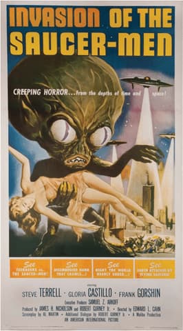
This poster for the 1957 science-fiction horror B-movie is one of the best movie posters ever. It just captures that fifties B-movie shtick perfectly: just the right balance between menacing and tongue-in-cheek. Also worth acknowledging that movies like this were being released at the height of the real-world flying saucer craze in the US – so it’s even more interesting in that cultural context.

This particular poster for the Wachowskis’ iconic 2005 film adaptation of the Alan Moore graphic novel is especially striking for its potent red and black colour scheme and use of shadow. A stunningly potent image for a stunningly potent film.

The 1962 SF/horror B-movie is very violent and very weird – as the poster might give away. But it’s a compulsive experience (also with a very cool soundtrack). And the poster does it’s job perfectly: conveying a potent mix of weird, unsettling and pulpy.

One of the greatest movies of its time also has an appropriately compelling theatrical poster. The iconic font for the title, the red tinge to everything (indicative of blood?) and the focus on the two main characters imposing over the panorama, and with the oppressive blood-red sun… it all conveys the sense of discomfort and impending doom. It captures the tone of Coppola’s movie very well.
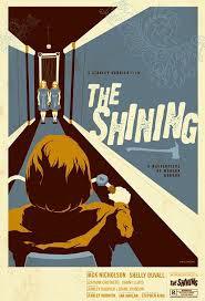
There are multiple different posters for the classic horror movie, and they’re all pretty interesting in style. But there’s something about this one that is the most striking. Might be something to do with the colour scheme; or maybe it’s the interesting use or sense of perspective. Or both.

This has got to be one of the very best film posters ever. It’s so dramatic, so dystopian and apocalyptic – conveying so much in just a still image. It’s also a very good distillation of what the classic 1981 John Carpenter movie is about. That’s a poster that gets you into the cinema to see a film – even if you have no idea what it’s about.

The poster for Alfred Hitchcock’s penultimate film in 1972 makes you absorbed in the idea straight away. A perfect visual encapsulation of psychological terror and the hint of hypnotic power.

It’s not necessarily a clever image, but it’s so iconic that it’s difficult not to include it. The classic theatrical poster for the 1956 sci-fi classic is somewhat cliched – the motif of the damsel-in-distress being carried or held by an imposing figure seems to recur in multiple film posters of that era, including several others that I’ve even included in this article. But it is one of the iconic sci-fi images and posters: even if it, like a number of the posters chosen here, is very much of its time.

Otto Preminger’s 1944 film noire movie is a classic; and of the very best films of its time and genre. And this poster crystallises that vibe and that era pretty perfectly. From a modern vantage, it seems to share as much in common with comic-book art or pulp sci-fi than with brooding film noire: but most of the posters for the film noire movies of the time followed this kind of stylistic path – and to great effect.
Just the poster alone draws you into its world and makes you want to explore these characters and this setting.
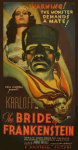
This 1935 sequel movie is one of the most iconic and influential movies of the twentieth century: and there are several variations of the posters for it, most of them similar in style. But this is the most compelling one to me, with the striking font for the film title and the beautifully rendered and textured character images. It almost feels like it could just as easily be the promotional poster for a magic show in the early 1900s.
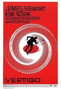
One of Hitchcock’s most iconic films fittingly enough comes with one of the most iconic movie posters of all time. It’s a simple image that doesn’t try to attach to any realism or real-world imagery. But it connects to the most famous visual element or effect in the movie: and perfectly expresses the dizziness or the sense of a situation spiralling out of control.
Simple and uncomplicated, but highly effective.

Like a number of the sci-fi B-movies of the fifties or forties, 1951’s The Man From Planet X just has that endearing, of-its-time charm and addictiveness. Released, again, at the height of the flying saucer fascination and the beginnings of the ‘contactee’ movement, the poster really captures the flying saucer iconography and vibe of the time.
And, for once, the female character isn’t being held or carried unconscious or helpless by the imposing figure. Which is a nice change.

The original Star Trek feature films from the 1980s tended to have pretty striking, artistic theatrical posters – just as the Star Wars films did. It’s that same kind of beautifully painted art (usually centered on superb character portraits imposed onto dramatic panoramas) that was popular in big cinema releases in the early-to-mid 1980s. The posters themselves were not just promos: but actual works of art themselves.
Although I think The Wrath of Khan and Search For Spock are better films: The Voyage Home poster is my favorite. The colour scheme or tint is striking; the Bird of Prey and the Golden Gate bridge is a great combination, and this is the only poster that manages to include portraits of every single character.

Known as the ‘Gone With the Wind’ style poster, Roger Kastel’s iconic painting was influenced by the 60s re-release poster for Gone With the Wind. Although this original Empire theatrical poster was rightly replaced (after Billy Dee Williams complained his character was nowhere to be seen in the painting), it has to be said that Kastel’s image set the style and tone for the primary theatrical posters that would define subsequent Star Wars cinematic releases, even down to the prequels.
It’s an iconic, old-school style of theatrical poster that would come to be a key visual component of the Star Wars cinematic brand: even though it would be Drew Struzan who would paint the primary theatrical posters for Star Wars films in the years to follow.

A really uncomfortable movie to watch; if you haven’t seen it, be warned – maybe do some googling first. But this simple poster does a good job encapsulating the subject and experience. It’s really clever the way the primary focus of the image – an innocent-looking Ellen Page – is juxtaposed with the violent implications of the torture device.
There’s only two objects in the image, but they sit so uncomfortably together that the poster itself almost induces cognitive dissonance.
And that’s the selection I’m going with. Tell me what I missed out, if you think there’s any glaring omission.



Reblogged this on theburningbloggerofbedlam and commented:
I hardly ever re-blog older posts, but I’ve been a little behind on new posts this passed week or so; so here’s a fun one from a while back… 🙂
I wish The Phantom Menace lived up to the potential of that awesome poster.
This is a good collection.
Thanks. And you’re right – the most exciting things about Phantom Menace were the trailers, the promo posters and the build-up. But I still think it had some great moments – and dammit, I still stand by Jake Lloyd as Anakin!
Excellent post, some amazing posters here.
Thanks dude.
Some great posters here, I would be tempted to include Jaws on there though.
Oh, Jaws! I knew there’d be stuff I’d overlooked. Cheers, mate.
Haha, no problem 😀
Great post, to think Star Wars Episode 1 had such a great poster but was such a bad film!
Hey, easy there – surely you’re not insinuating that there was anything wrong with The Phantom Menace?